
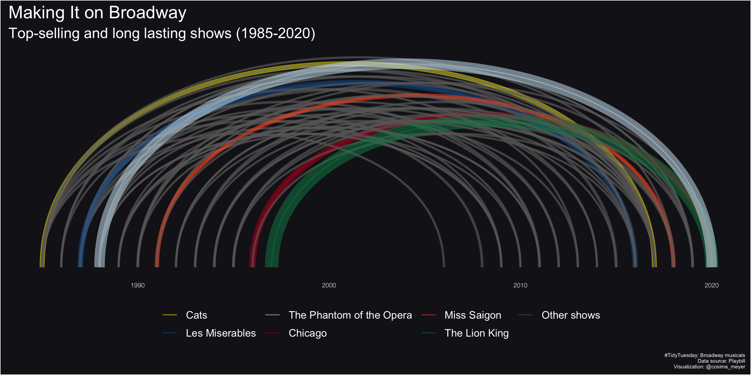
This is a late version of a TidyTuesday. I started working on it a while ago and could not finish it – but here you go! The TidyTuesday was about Broadway musicals with a dataset by Playbill. I plotted an arc diagram with ggraph visualizing how long the musical was played, coloring the top 6 musicals based on the weekly gross the plays generated. I colored those six musicals with colors from their original logo.
While it might not come as a surprise to you, “The Phantom of the Opera” appears to be the most popular musical – both in terms of length and weekly gross!
The code is available on my GitHub. You also find a larger version of the figure here.