
It’s time for TidyTuesday again! As a kid, when Lance Armstrong and Jan Ullrich were competing over the title, I would spend a good part of my summer holidays watching the Tour de France and being impressed by the fascinating and (fast changing) landscape the stages have to offer.
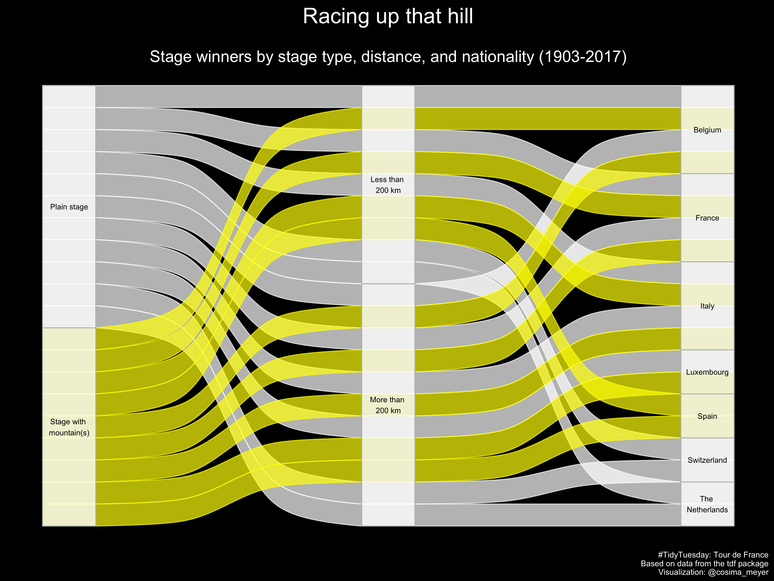
This week’s sankey plot shows the distribution of stage winners by stage type, distance, and nationality.
And, what do we get out of it? Based on the plot, there are apparently a couple of countries who are better in winning plain stages (Switzerland and the Netherlands) while other countries (such as Spain) are better in winning hilly stages.
The code is available on my GitHub. You also find a larger version of the figure here.